This Might Just Be Your Favorite Design Tool
You know the look. Wide eyed amazement over your array of stone slabs dissolves to consternation then confusion. There are a LOT of choices in the yard, in the studio, in the showroom and the customer is overwhelmed.
How do you help them choose a slab of granite? How do you pair their need for a functional and stylish kitchen counter with the marble sitting in your yard? And what’s that dark grey one? Soapstone? What does that go with?

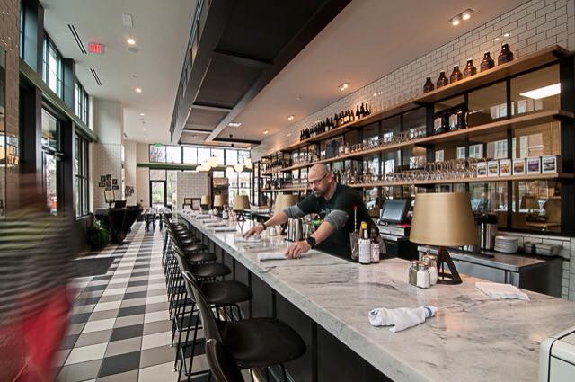
Photo:Polycor’sPearl Grey Georgia Marble at The General Muir in Emory Point, Georgia. This Dwell on Design winner was designed by Atlanta’s Square Feet Studio.
As a distributor, fabricator or designer it’s in your best interest to guide your customer to a stone that A) works for their lives B) matches their aesthetic and C) looks amazing in their space so all their friends ask where they got it.

To do that the stone must be part of a cohesive design. Easy for you, but sometimes hard for the homeowner to envision. Do I start with window treatments? The tile? The cabinets? We say start with your biggest, most permanent investment – the stone countertop. Pick the slab you fall in love with and design your space around it.
That’s why we created a series of design boards just for you and your customers.
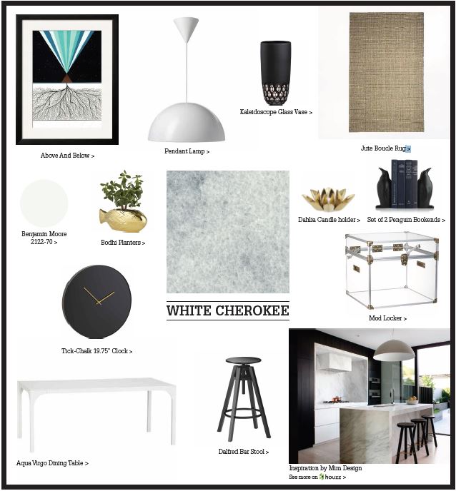
We’ve chosen 12 of our North American stones, including the perennial favorites Cambrian Black Granite from Quebec and White Cherokee Marble from Georgia and the newcomer, enigmatic Alberene Soapstone from the hills of Virginia, and featured them on one sheet design boards designed to give your customer context on each of the materials.
How would White Cherokee Marble look in a modern kitchen with a waterfall island? How would Cambrian Black work with woodwork in a kitchen? With lacquered cabinets? Can you use Alberene Soapstone in a bathroom? These free PDF downloads give you the resource to answer these customer questions.

Photo: Island Bar in Cambrian Black Granite in antiqued finish designed by Metropolitan Cabinets and Countertops from Northwood, Massachusettes.
In these mood boards you’ll find on trend accessories and paint choices with classic natural materials like warm wood furniture and edgy lacquered pieces, and of course, natural marble, granite, limestone and soapstone. We designed these boards to help you help your customers see the vision for your stone in their space.
In the Alberene Soapstone board we paired the rich and rustic stone with a shallow white porcelain vessel sink that pops against the deep grey of the soapstone. Soapstone hasn’t received a lot of press and where it has some have used it more as shabby than chic. So here we chose an installation by San Francisco designer Annabelle Herrara who paired the vanity with luxurious and classic marble tile and brushed nickel wall mounted bath fixtures. There’s no shabby in this bathroom. For added texture and warmth in our board we included organic woodgrain bath towels in grey hues and Parsons full length mirror covered in grass cloth from West Elm. Now newcomers to soapstone can see how it stands out as a feature and plays well with traditional luxury and rustic materials. And each item on the board is linked to houzz where designers and homeowners can get more ideas launched intheir quest for accessories.
Each board includes a kitchen or bathroom installation with natural stone in styles ranging from slick modern to transitional luxury to rustic chic. You already know that neutral stones with subtle veining are the backdrop for timeless designs, but your customer may be stuck on cabinet pairings, flooring choices and even stone variety selection. Use these boards to help guide them.

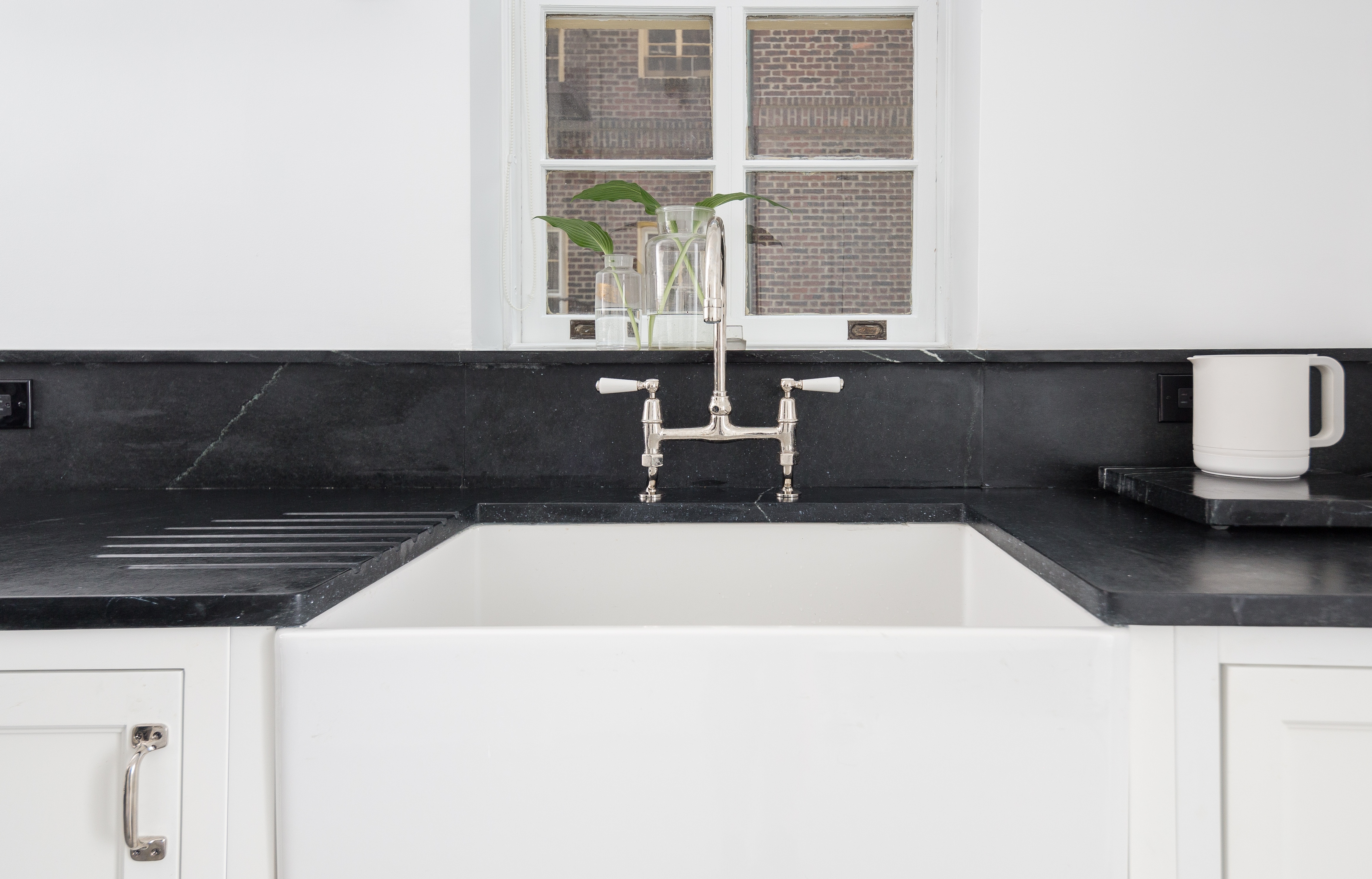
Photo: Another example of Polycor’s Alberene Soapstone at a Brooklyn brownstone with a honed and waxed finish and a classic pairing with a porcelain glazed fireclay farm sink.
No doubt you have your own personal style and if you design or fabricate with natural stone you have your go to materials and finishes. If your clients’ have taste outside your usual style of work, the boards can prove the versatility of your materials and experience.
The mood cast by each natural stone variety is as much driven by the other design choices in the room as it is by the stone’s character. In the St. Pierre Linear Limestone design board we’ve set the stage for a bathroom with a masculine feel. The deep toned grey and brown stone has long veining reminiscent of a river bed. For design inspiration we included an installation example featuring a thick cut floating vanity paired with a matching sink and subtle grey ceramic tile that make the bathroom feel clean, modern and substantial. We furthered the masculine feel with weighty matte black accessories, black dog art and wood features.
What you won’t find on these boards is stone in busy patterns. At Polycor we favor neutral stones and subtle patterns for their ability to span style and era. Using trendy, easy to swap out accessories – mirrors, shelving and furniture – along with the timeless natural stone, give homeowners’ spaces longevity. That means a more enduring and attractive example of your design and fabrication work.
Whether edgy or restrained the design choices in these boards will help expand your client’s vision for natural stone in their living space. There is no right or wrong. Instead, more versions of what you can achieve with the same materials.
Genevieve Robichaud is Vice President of Marketing at Polycor. In addition to managing the company’s communications she creates digital tools for distributors, designers and fabricators to make selling, designing and working with natural stone easier.


