A Modern Marble Kitchen With Long Linear Veins and a Thin Edge
Brooklyn-based architect Christopher Lee works for firms known for innovations with material; He once collaborated on a project called Heavy Rocker, Light Rocker, which consisted of a singular form with multiple quasi-functional uses rendered in two materials; one of perforated metal and the other from stone. So it’s not surprising that when he undertook a redo of his New York City residence, an apartment in a mid-century building with great old bones, he used the reno for material exploration.
Lee is a founding partner at Modal Practice, overseeing multiple projects varying in scale from installations to tenant improvements to new buildings so, naturally, he also designed the renovation of his family home in Fort Greene.
For the project, Lee focused on the kitchen, creating a common space for his growing family, that is minimal in its aesthetic but also warm and inviting, with a thoughtful mix of materials. In the space, new ideas connect with nods to the past in interesting ways.
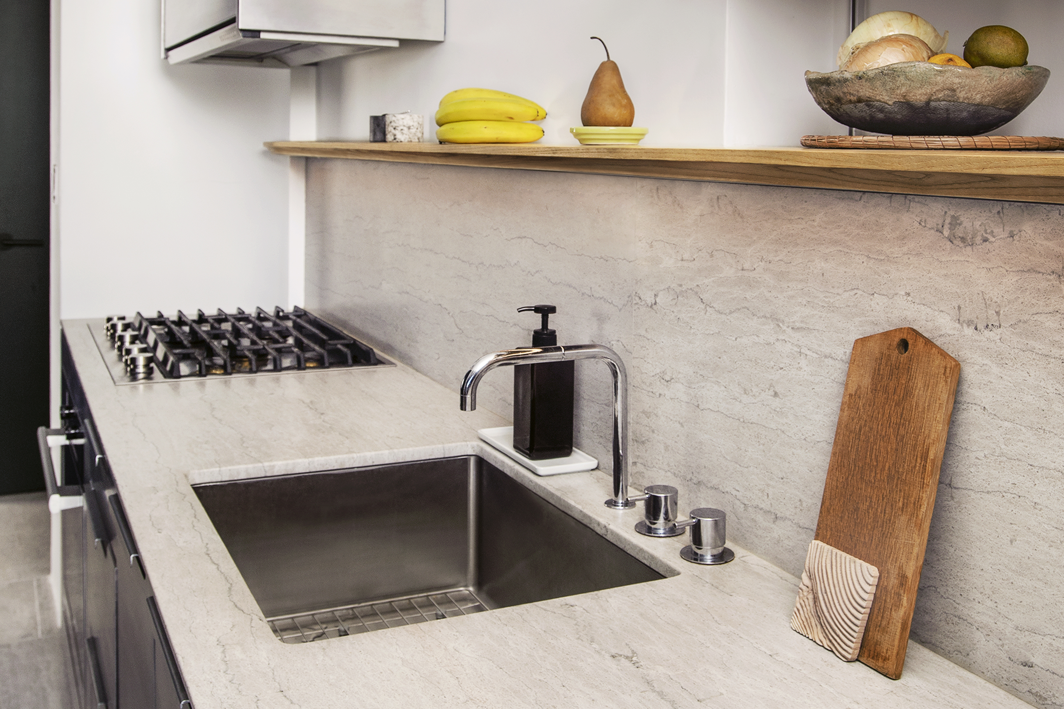
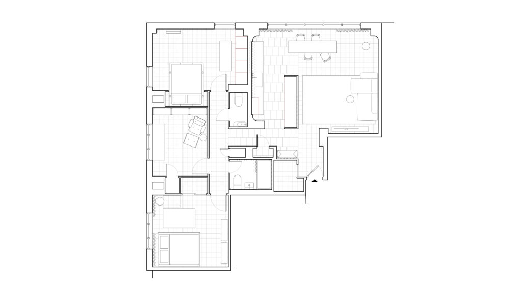
The design concept for the apartment extended from the idea of a minimal intervention with maximum effect. The basic bones of the apartment are intact from the original late 50s design. For the renovation, all walls and fixtures maintained their original configuration. The design intervention focused on the core of the apartment, the kitchen, bathrooms, and corridor between public and private spaces.
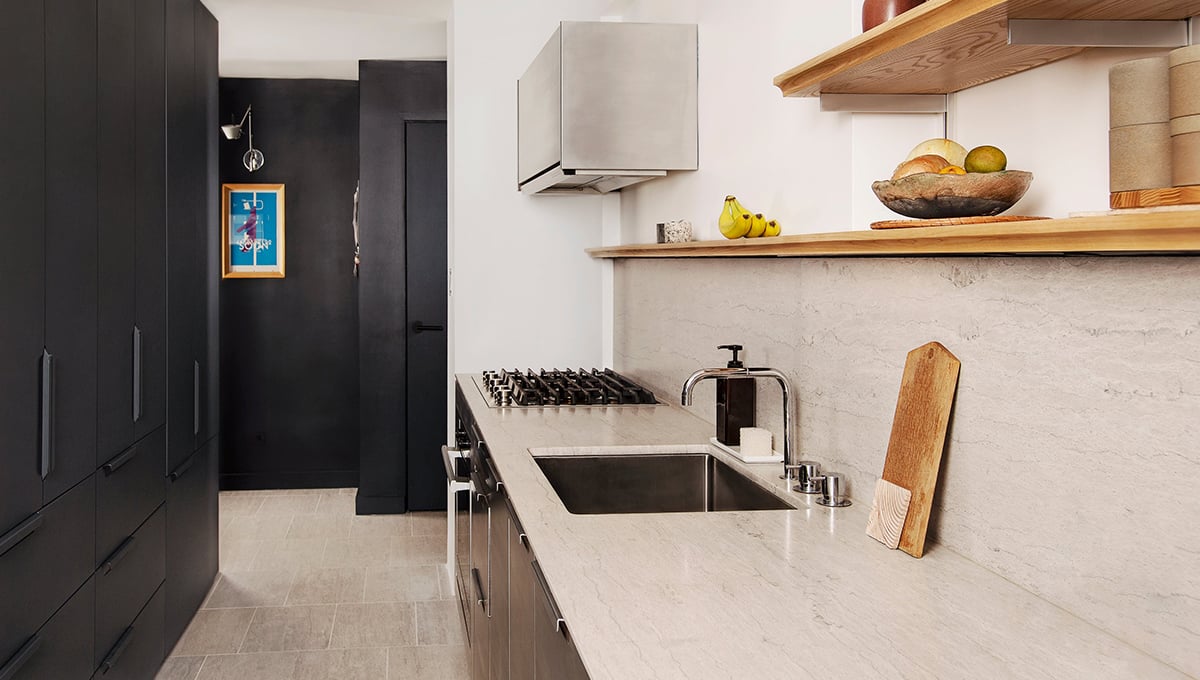
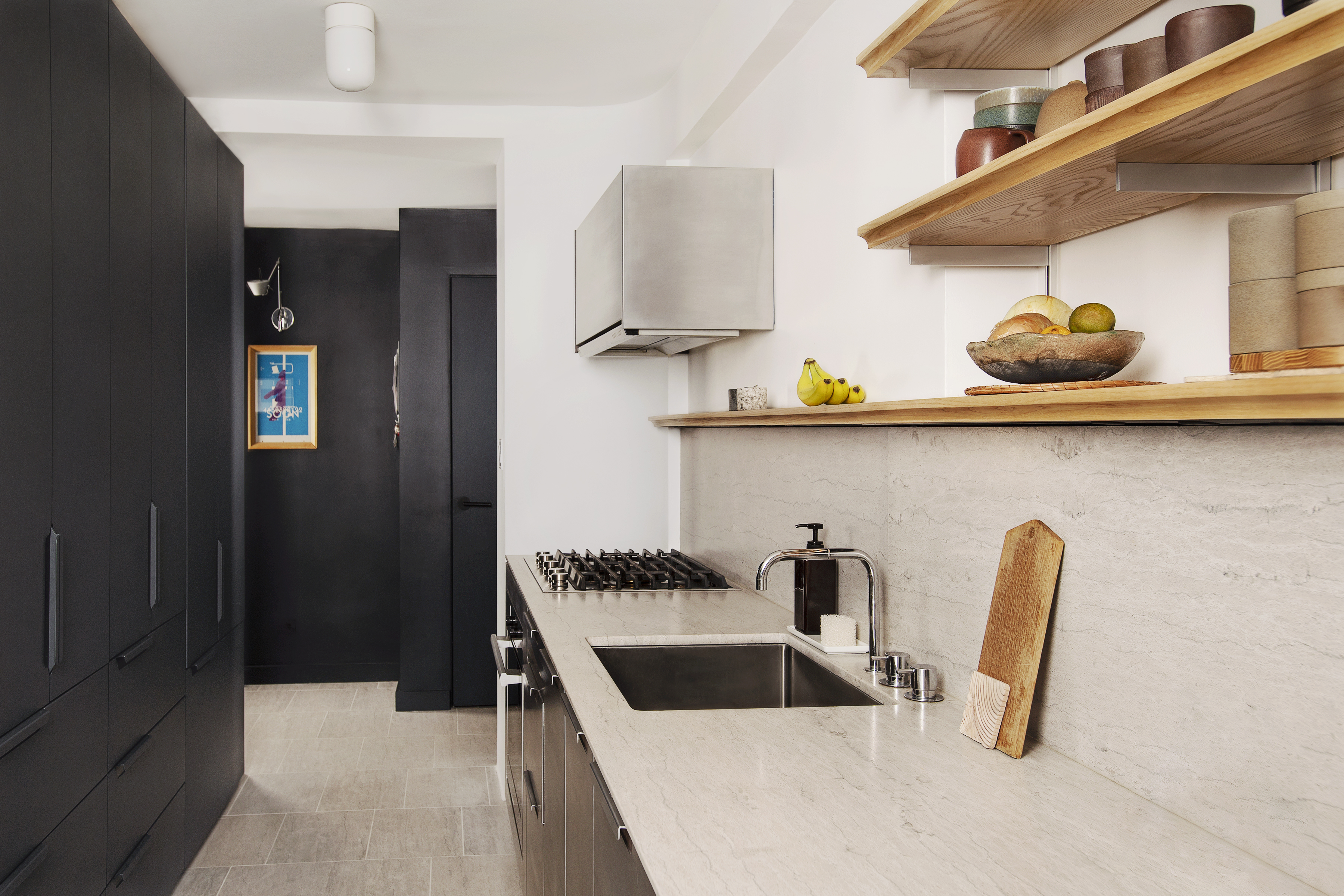
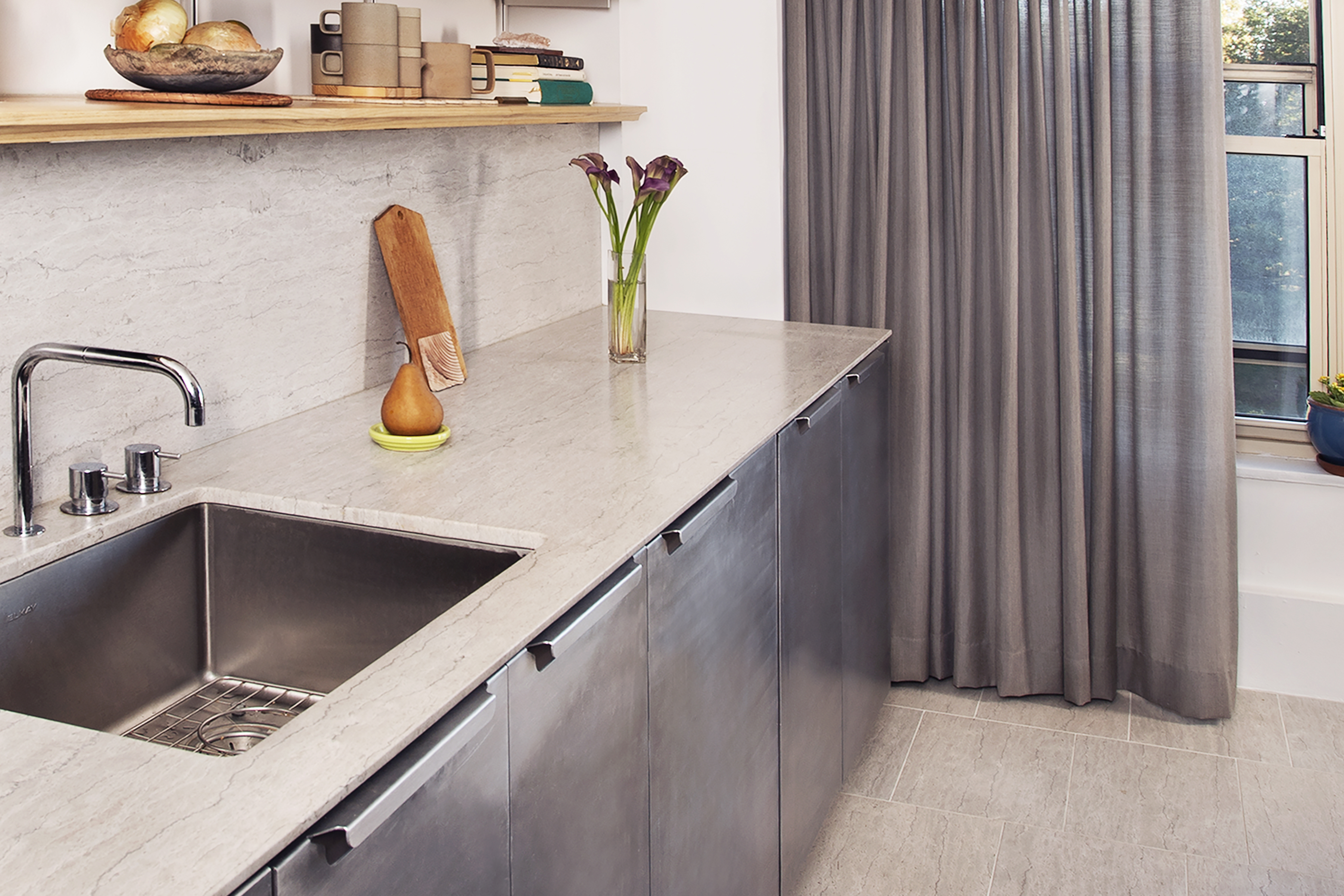
There was a focus on the kitchen, and the ideas for that redo were innovative: Lee used Saint Clair™ Linear marble for the kitchen backsplash, and the countertop, and even the floor tiles, with a unique edge detail (a reverse cove) on the countertop to give the appearance of an ultra-thin surface with a 3/8″ vertical face.
See more stone ideas for inside and outside the home. Download the Residential Brochure
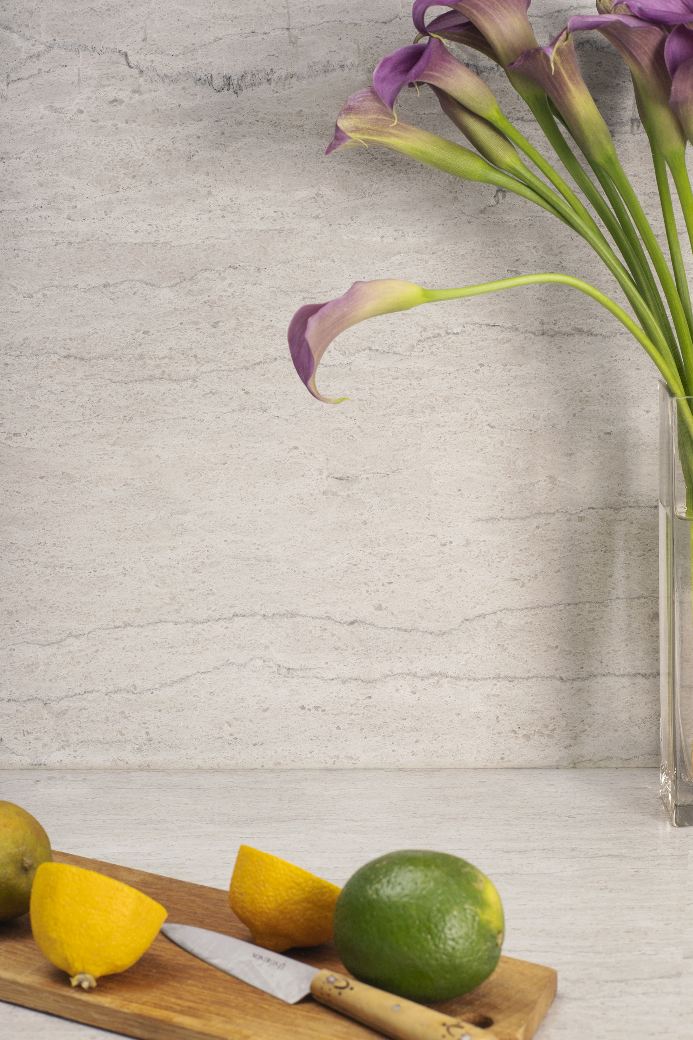
“We came to Polycor in search of a stone countertop and backsplash,” Lee says. “We were seeking a stone that would be at once luxe, yet subtle and quiet. The Saint Clair™ Linear marble was unique in that it had the usual properties of marble, but was more dense and resilient than a typical marble. These qualities made Saint Clair™ the perfect choice for both the countertop and floor finish application. The linear cut reveals a movement and grain that helps to emphasize the linear aspect of the kitchen design.”
The full backsplash is an interesting element in the new kitchen. It’s large format, rendered as an uninterrupted stone surface and capped by a continuous wooden ledge. Lee says: “The continuity of the surface provides a clean and unfettered kitchen backdrop, allowing the natural material to showcase its inherent richness.” To keep the backsplash as pure as possible, power outlets were concealed beneath the shelving.
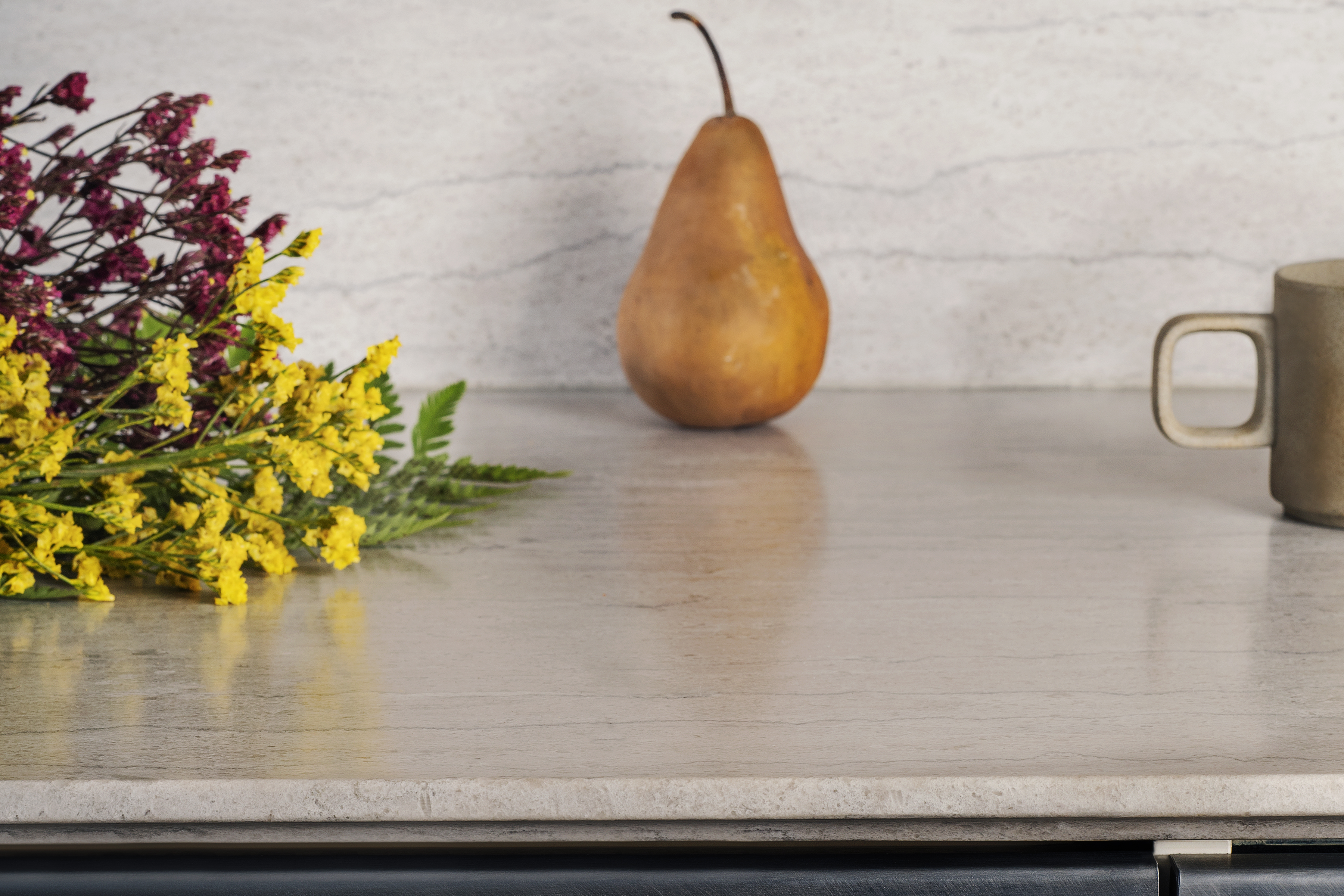
In a similar approach, the countertop is detailed with minimal design. A simple cove profile provides the appearance of thinness and lightness, contrasting with the stone’s heavy and robust qualities. “The edge detail is traditionally used with the cutaway portion in plain view,” says Lee. “The cove detail, in our case, is at the underside of the countertop, largely hidden from view. The use of this detail is less about decoration and more about setting up these dual readings of the material. The edge detail is cut away. It looks like it’s really thin, but it’s not.” The countertop is actually 2 cm (3/4″) thickness.
Lee says the Saint Clair™ material lent itself perfectly to a floor application as well. “The floor tiles are a cut-to-size 12″ x 18″, set in a staggered pattern that draws your eye to the spaces beyond.” They have a warmth that is inviting rather than cold. “The material use on both floor and countertop allowed us to keep the material palette to a minimum.”
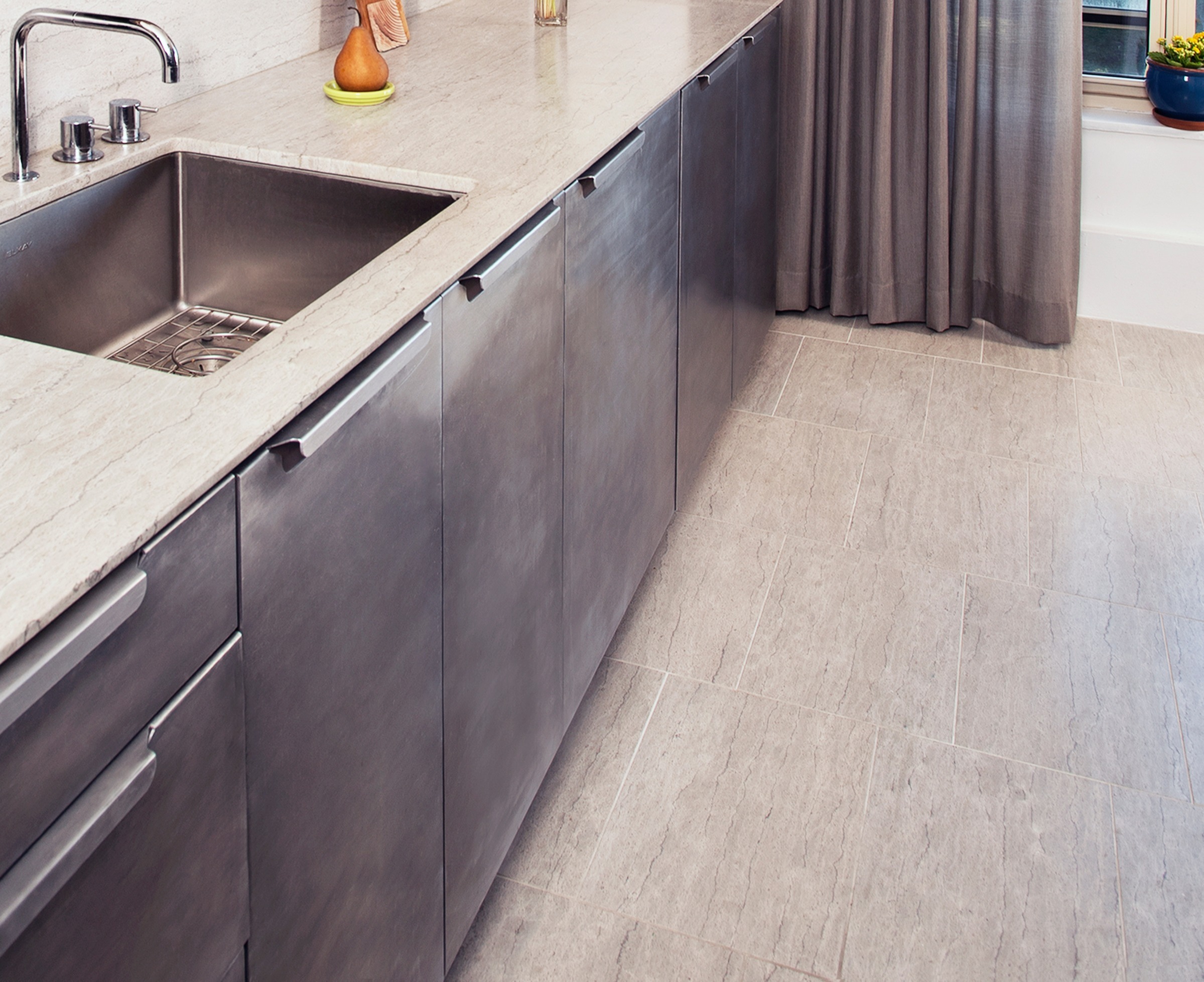
The fabricator, Foro Marble Company, is local to the project. “We’ve done a few projects with Foro and they’ve always done excellent work. The existing conditions were laser measured and surveyed with aerospace accuracy to ensure that installation was seamless,” Lee said.
The Saint Clair™ countertop sits atop aluminum clad cabinetry from Reform, a Scandinavian company known for producing customizable cabinet fronts for use with Ikea base cabinets. On one side of the kitchen, the aluminum is left raw and unfinished, which will patina over time. The other side of the kitchen uses the same aluminum cabinet fronts, but is finished with an anthracite powder coat finish.
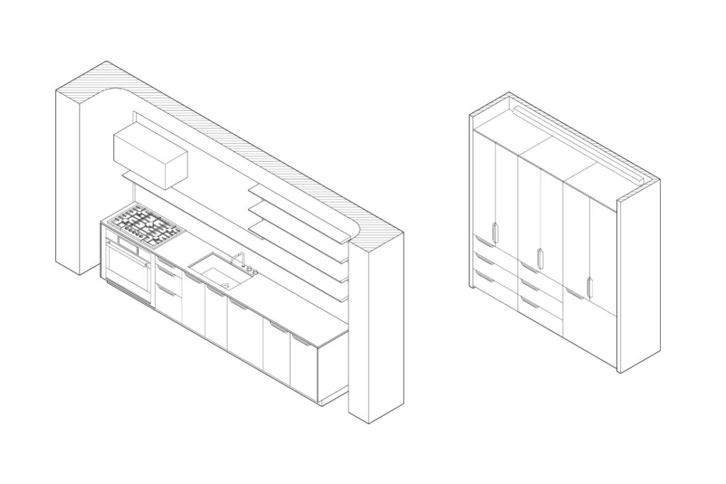
Ash wood shelves bring soft wood tones to the space, and allow for easy access to frequently used dishware and kitchen supplies. The kitchen hood is also clad in the aluminum panels, like a floating sculptural aluminum box. The vola kitchen faucets, designed in collaboration with Arne Jacobsen, are a nod to the era from which the building is built; they are clean, modern, and in this case, reclaimed from another architecture project.
Is there a connection between the Heavy Rocker, Light Rocker project and the ideas of single form in the kitchen? “Our renovation using the Saint Clair isn’t directly tied to this project, but draws on similar concepts,” Lee said. “In the design, we try to create moments of the unexpected while still remaining familiar and comfortable.”
